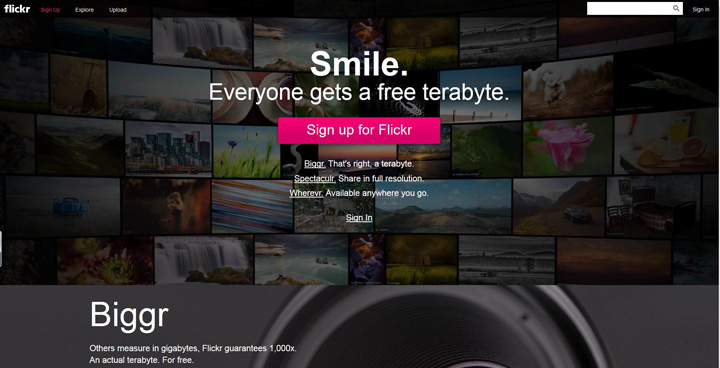
Flickr has recently changed the WEB layout and offers a whole TERABYTE of space to users.
At the beginning of the year FLICKR released the new SMARTPHONE APP with direct intention to win over Instagram users
with “richer” experience. Flickr app has better camera controls but… still it’s a copy of Instagram app
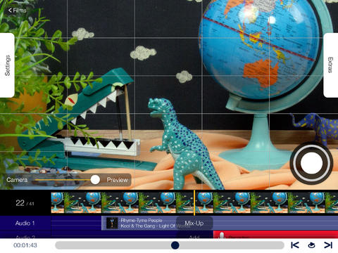
Here is video Flickr App overview, and you can check out full APPLICATION manual HERE
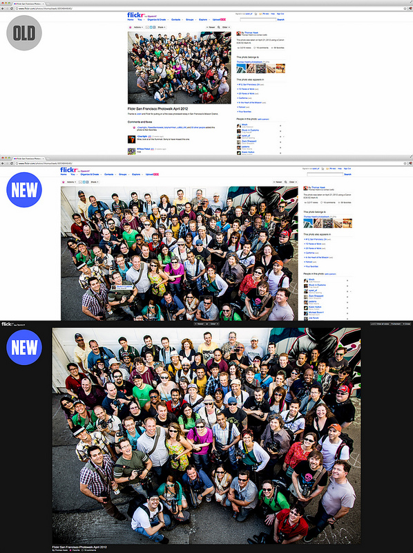
As for the WEB APP …. I like the new look and what they did with navigation. It’s all about photos so the new full resolution view is great solution (and only reasonable one)
Here is a little ” design evolution overview” :
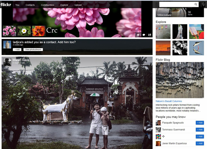
The new WELCOME PAGE

I like the new layout and the FEED you get on the home page when you log in, it’s much better UI experience
Navigation is easier, and they managed to make room for ads as well 😉
I like the new FLICKR , it’s UPGRADED definetly

