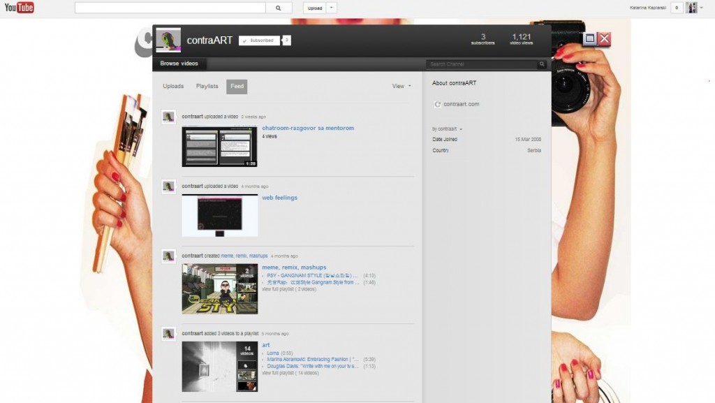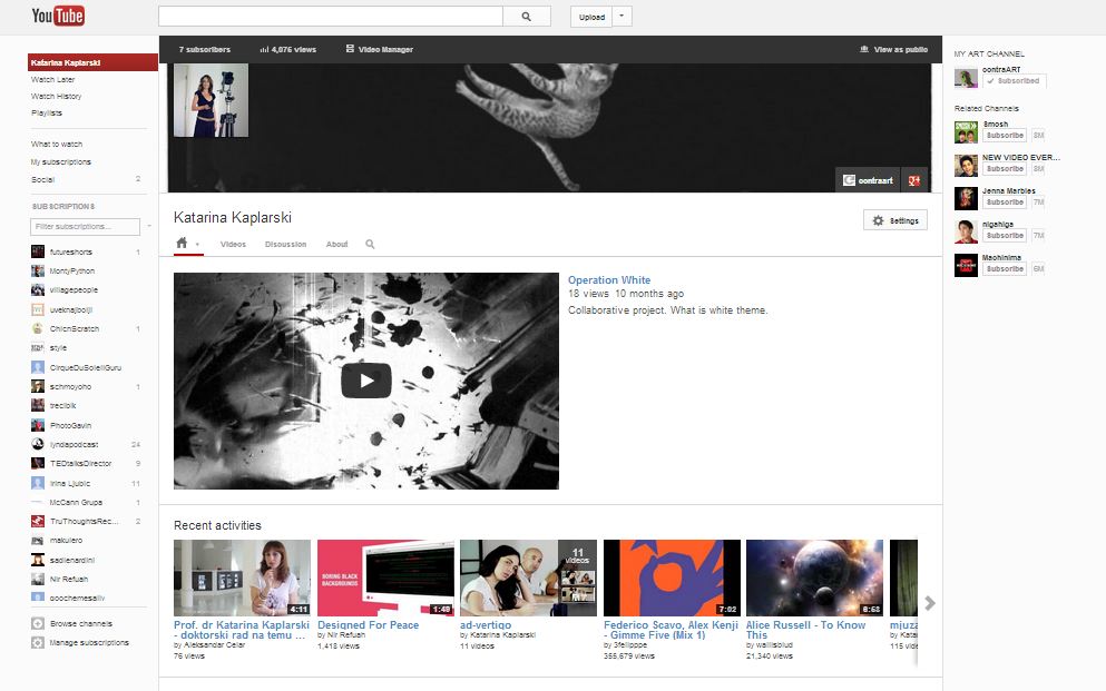
Youtube has a new look again, actually the Youtube channels are quite different.
Overall impression:setting new channel is not so user-friendly, but after a while you get used to it.
NEW CHANNEL LOOK
OLD CHANNEL LOOK
Channel ART (header image) has to be at least 2120 x 1192px (!!!) in order to be responsive(?).
But I think they overdid it – Could be better solution for design version for TV.
But it is supposed to look like this on different screens:
I like the loader on top of the page -subtle red line, it’s hard to printscreen.
I also like WHAT TO WATCH menu with SOCIAL connection apps that give you possibility to view all shared videos cross your
g+, Fb, and Tw platforms.


